Project details
Client
Gobelins
Category
Product Design
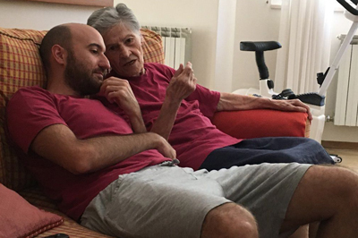
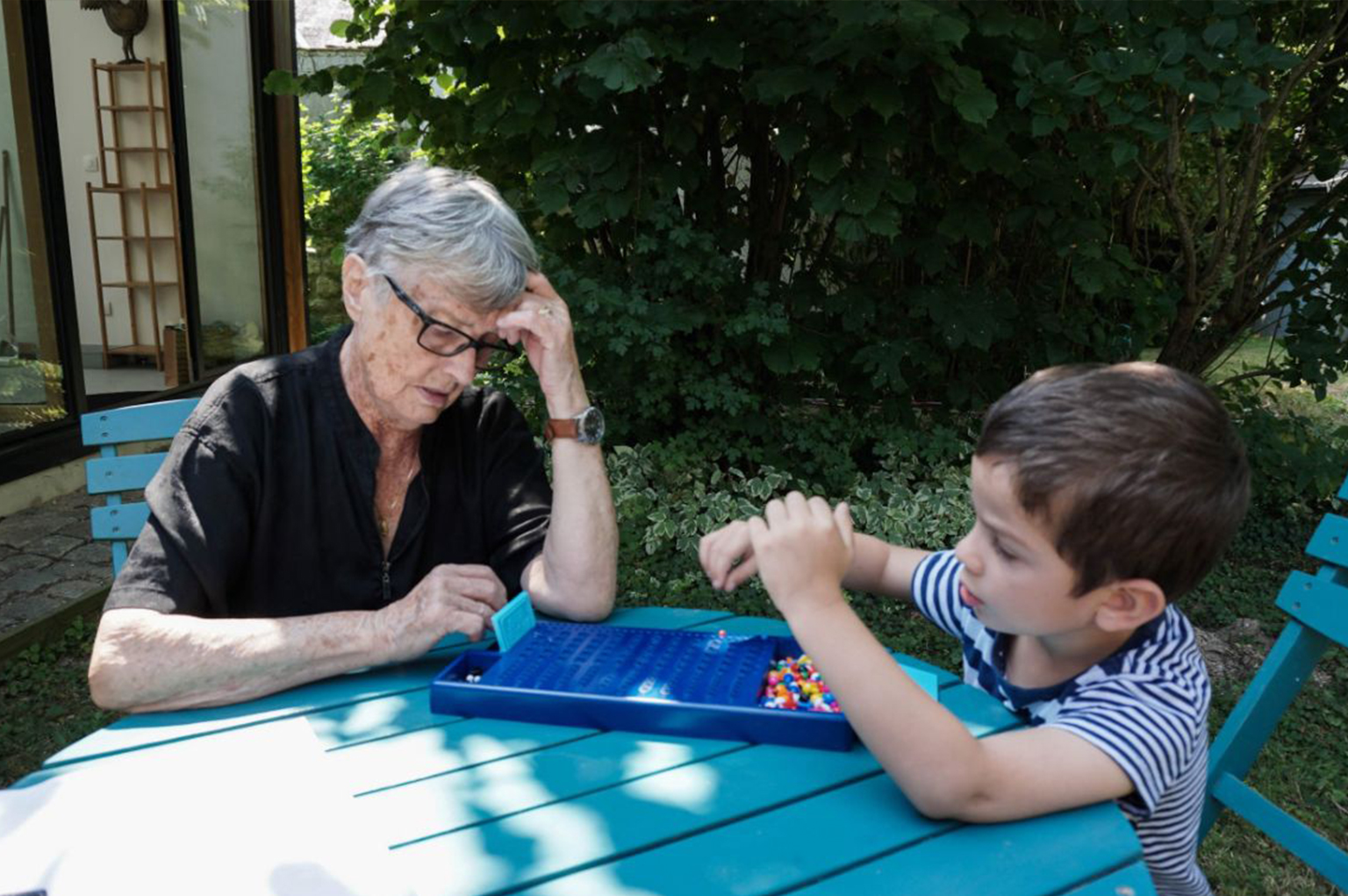
For this final project of my year at Gobelins School in Master 2 “UX Manager / Digital Project Director”), my workgroup wanted to build a project around family carers of the elderly (“les aidants” in french), who play an essential role in our society, but are often faced with considerable challenges. As my own grandmother gradually declined cognitively, this project idea particularly struck a chord with me, and gave me the desire to see what the UX approach could bring to this often neglected audience.
Primary & Secondary Research
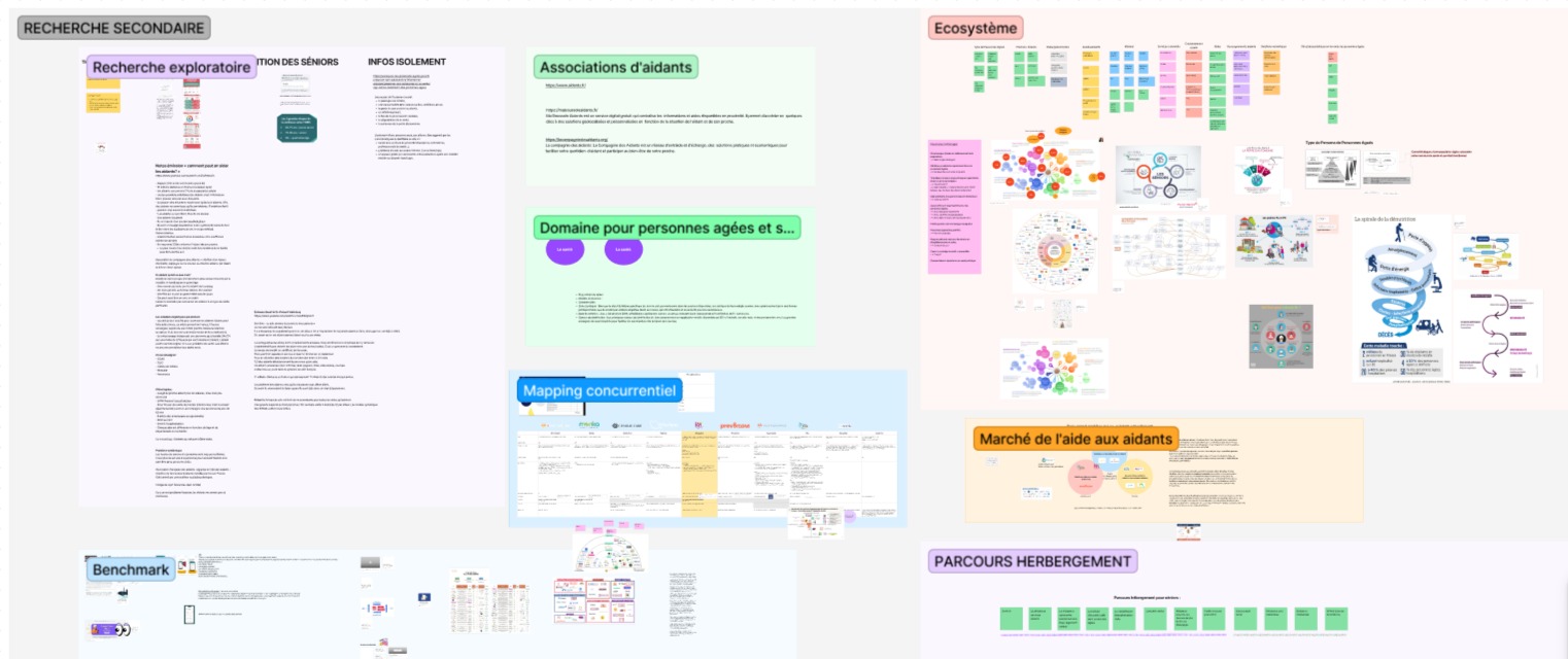
What we had in common, within our workgroup, at the outset, was the desire to work on a subject that made sense to us. We quickly came together around the idea of building something that would at some point meet the needs of the senior or elderly population, without our digital solution necessarily being aimed at them. To refine our thinking, we needed to gain a better understanding of the needs and friction points of this population. We therefore began primary and secondary research.
Through research and meetings with various experts, we quickly became aware of the world of caregiving, and were struck by the loneliness and helplessness that some caregivers can experience. We then decided to focus our project in this direction, and offer an innovative support solution for this population, often in the shadow of dependent elderly people.
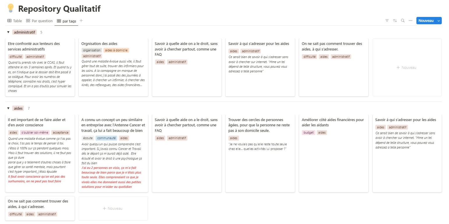
To continue our project delineation, we then undertook user research. This mainly took the form of qualitative interviews with several different populations. Once we had identified our targets, we set up interviews, generally remote for greater convenience, lasting between 30 minutes and 1 hour. We had drawn up a common protocol, which we adapted slightly according to the target audience and their professions.
For greater clarity, we built a repository according to the principles of Atomic Research, and integrated the answers to our interview questions in it. This has enabled us to identify common insights and directions for our project.
Ideation
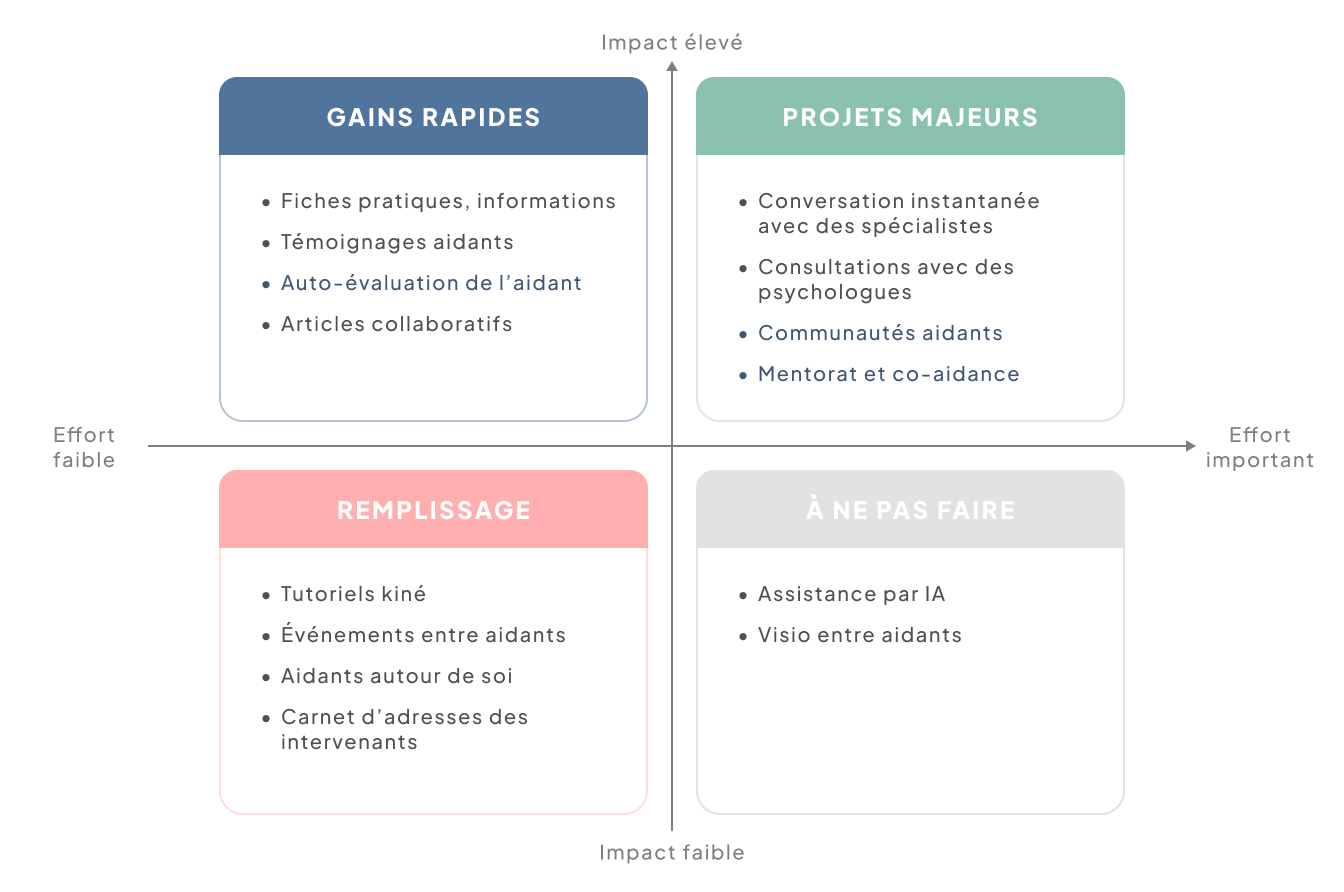
We then used a prioritization matrix to assess the feasibility and potential benefits of each idea. This helped us to identify the most promising concepts on which to focus. We also continued to refer to our research findings to ensure that our ideas would actually meet the needs of caregivers.
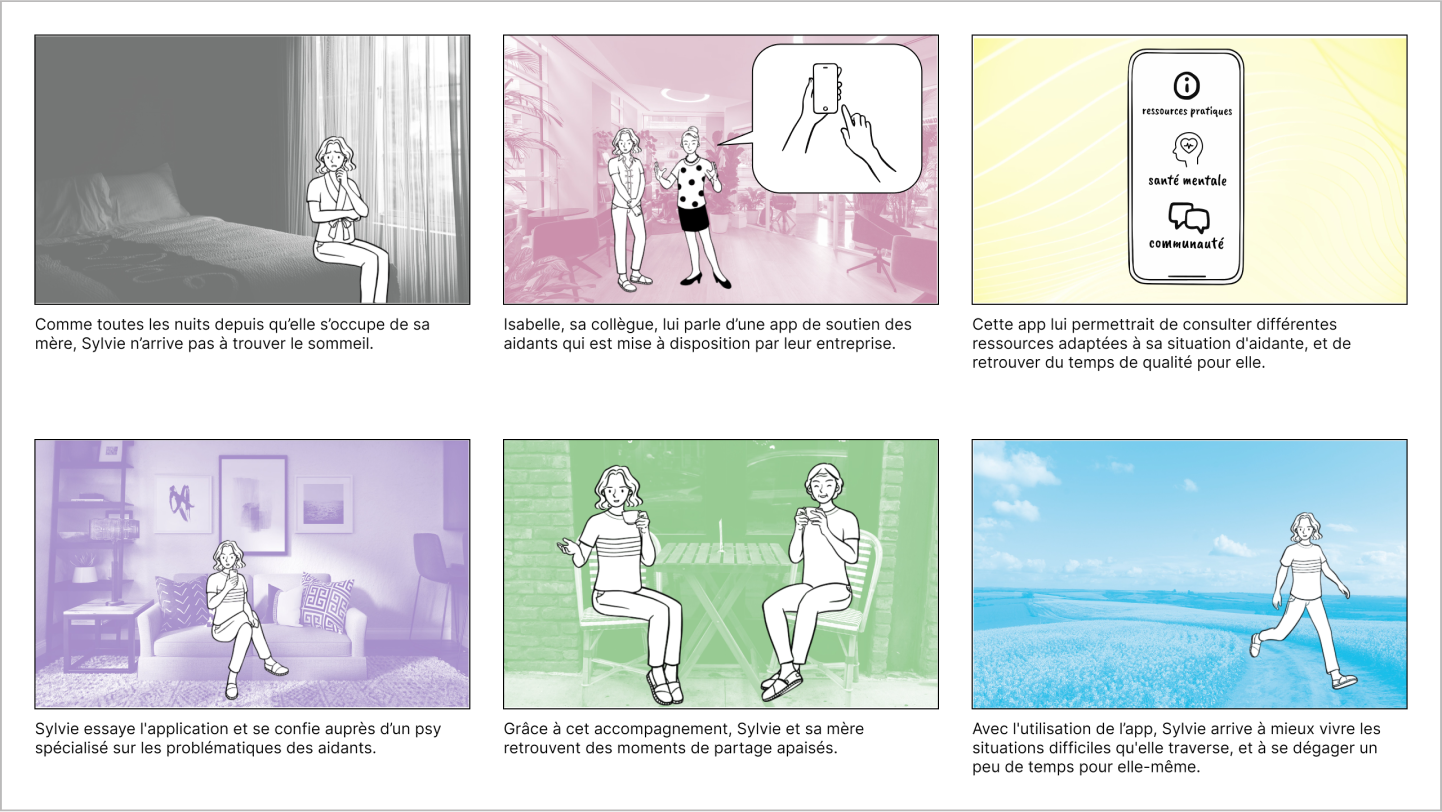
Once the priority functionalities had been identified, we drew up a storyboard to bring our user journey to life. The storyboard was used to illustrate and sequence the main stages of the experience, staging the key interactions with our product. This visualization helped us understand how our users would interact with the various functionalities in a realistic context.
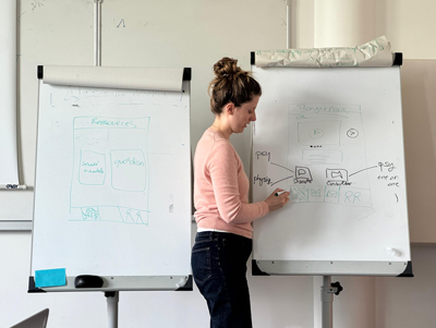
To structure our product in a coherent way, we identified three main categories. These categories represented the key segments of our product, each dedicated to a specific aspect of the user experience and therefore of the caregiver of an elderly relative, often isolated and responsible for a heavy mental burden, as we had identified during the research phase. We worked to map the functionalities into these three categories, ensuring that each element was positioned in a logical and intuitive way.
well-being / management of the everyday life / community
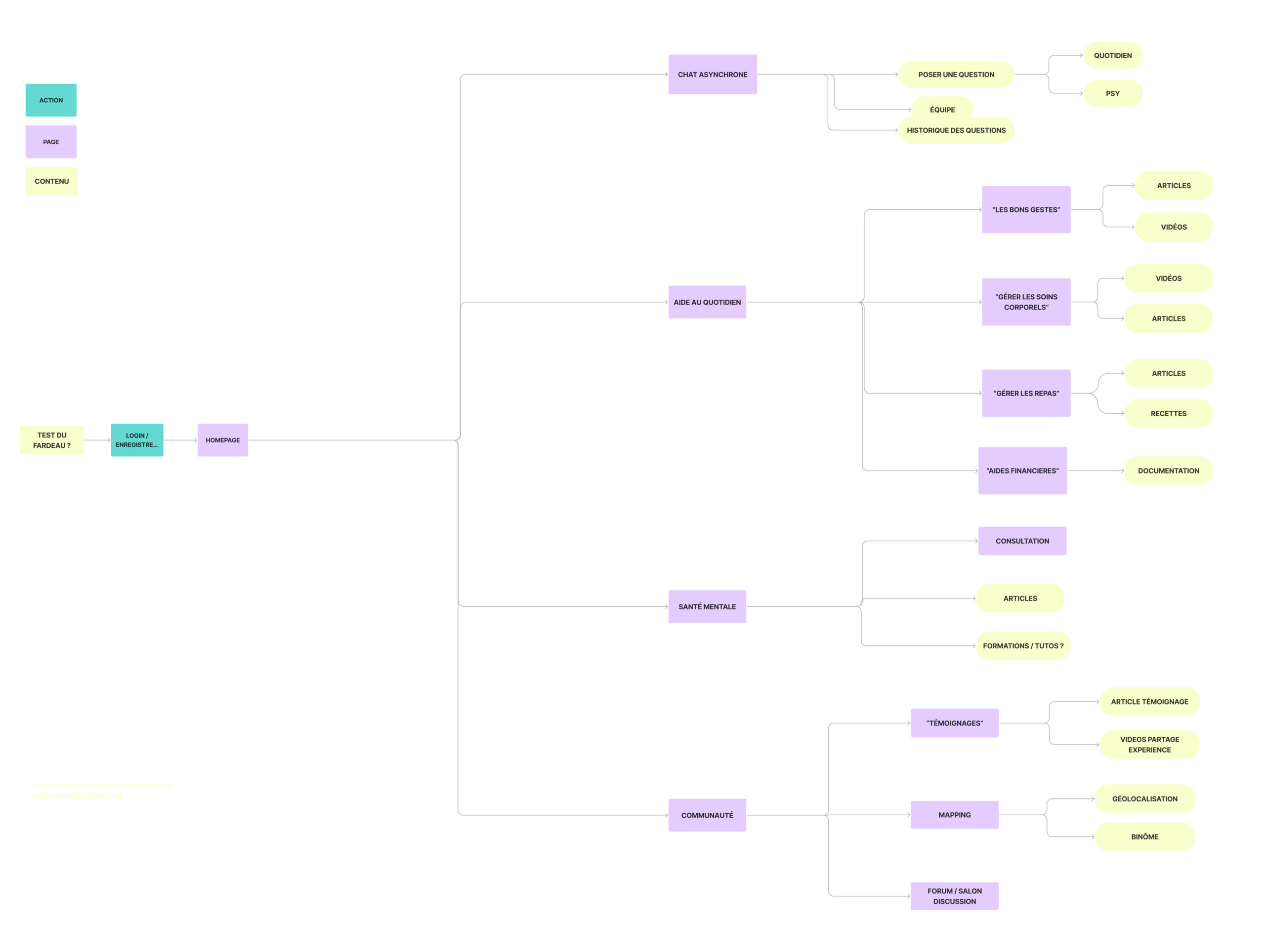
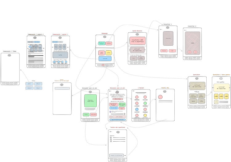
At the same time, we collaboratively developed the Figma user flow. This flow details each stage of the user journey, from the first interaction to the achievement of the main objectives. This approach enabled us to ensure that each feature was well integrated into the overall journey. For example, we wanted to highlight the asynchronous chat functionality, which we felt was the real added value of our application. We therefore chose to position it on the menu bar, so that it would always be accessible to the user.
Prototyping
Once the user flow had been defined, we created low-fidelity wireframes. These simple, uncluttered sketches were used to structure the layout of elements on each screen, without worrying about aesthetic details at this stage. The aim was to validate the interface structure and functional organization before moving on to more detailed designs.
The final step was to move on to the high-fidelity prototype, refining the work done previously on the wireframes. We worked with a Design Kit to simplify the process and maintain visual consistency across all screens.
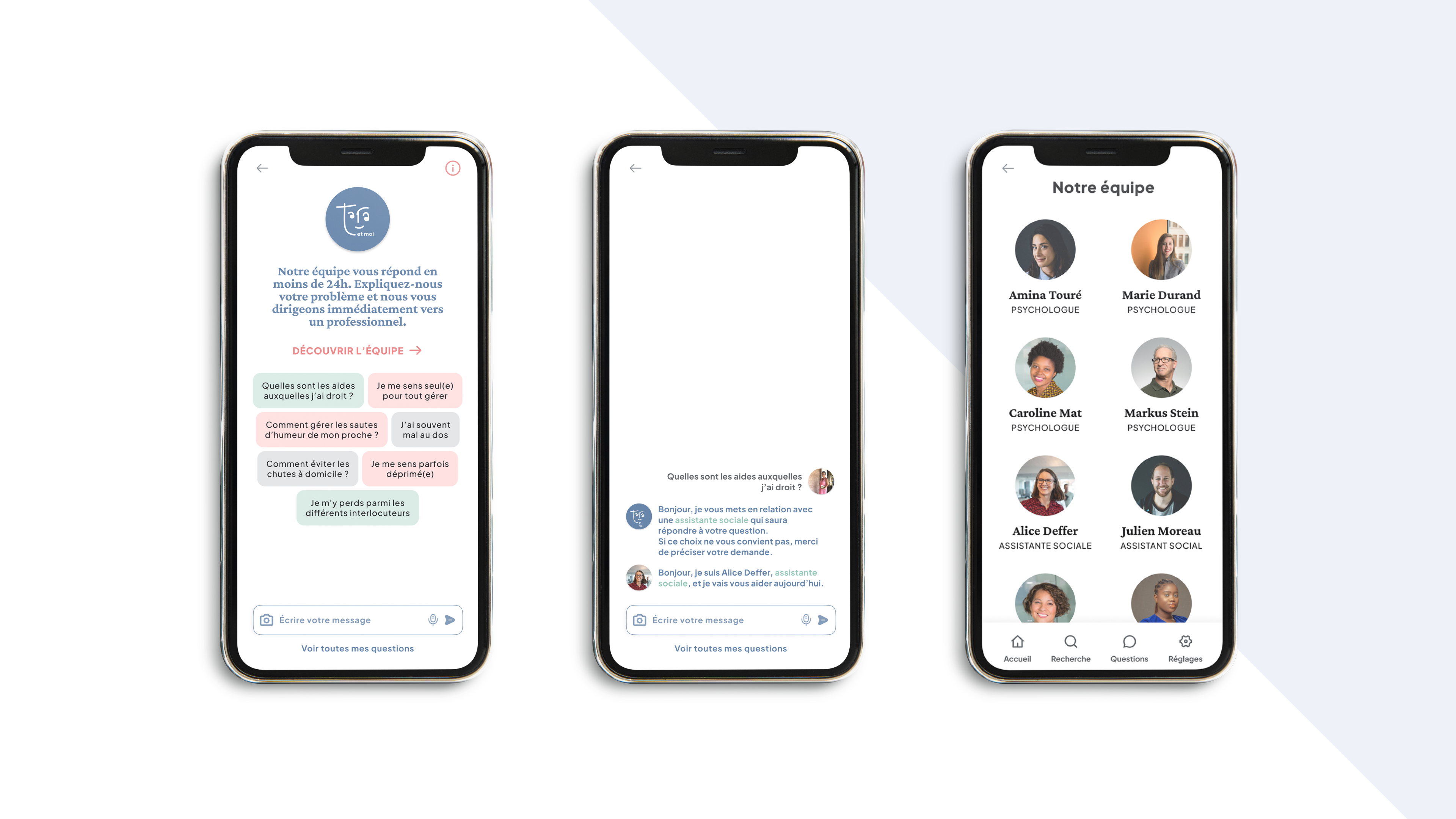
Our main feature, an asynchronous chat with care professionals (social worker, specialist nurse and psychologist) was chosen to offer caregivers maximum flexibility.
This mode of communication enables caregivers to ask questions and receive advice at their convenience, without the constraints of fixed schedules.
The chat answers the crucial need for centralized information, addressing the problem of the obstacle course often encountered by caregivers. What’s more, it eases the mental burden on caregivers, preventing burn-out, while offering continuous, accessible support that helps avoid isolation.


